The Text+Texture Project is a great exercise in both text formatting and working on a grid. Various aspects of text formatting such as proper use of en- and em-dash, the proper use and formatting of justified text alignment, and type pairing, and how type pairing can be used to emphasize the content of the composition were touched on very nicely. In this particular composition, a sans serif font was used for the various headers in order to create a more distinct hierarchy, with the main header in bold and various subheaders less bold in order of importance. Then, a serif font was used in the body to create a slight dissonance that reflected the textures that were set into the composition. The texture component presented challenges in finding examples of a light to dark linear progression, so instead a linear progression of rough to grainy was used, with mostly lighter textures placed behind darker text boxes for contrast. This contrast put a strong emphasis on the text which may not have been as easily attained using a light to dark progression
You may also like
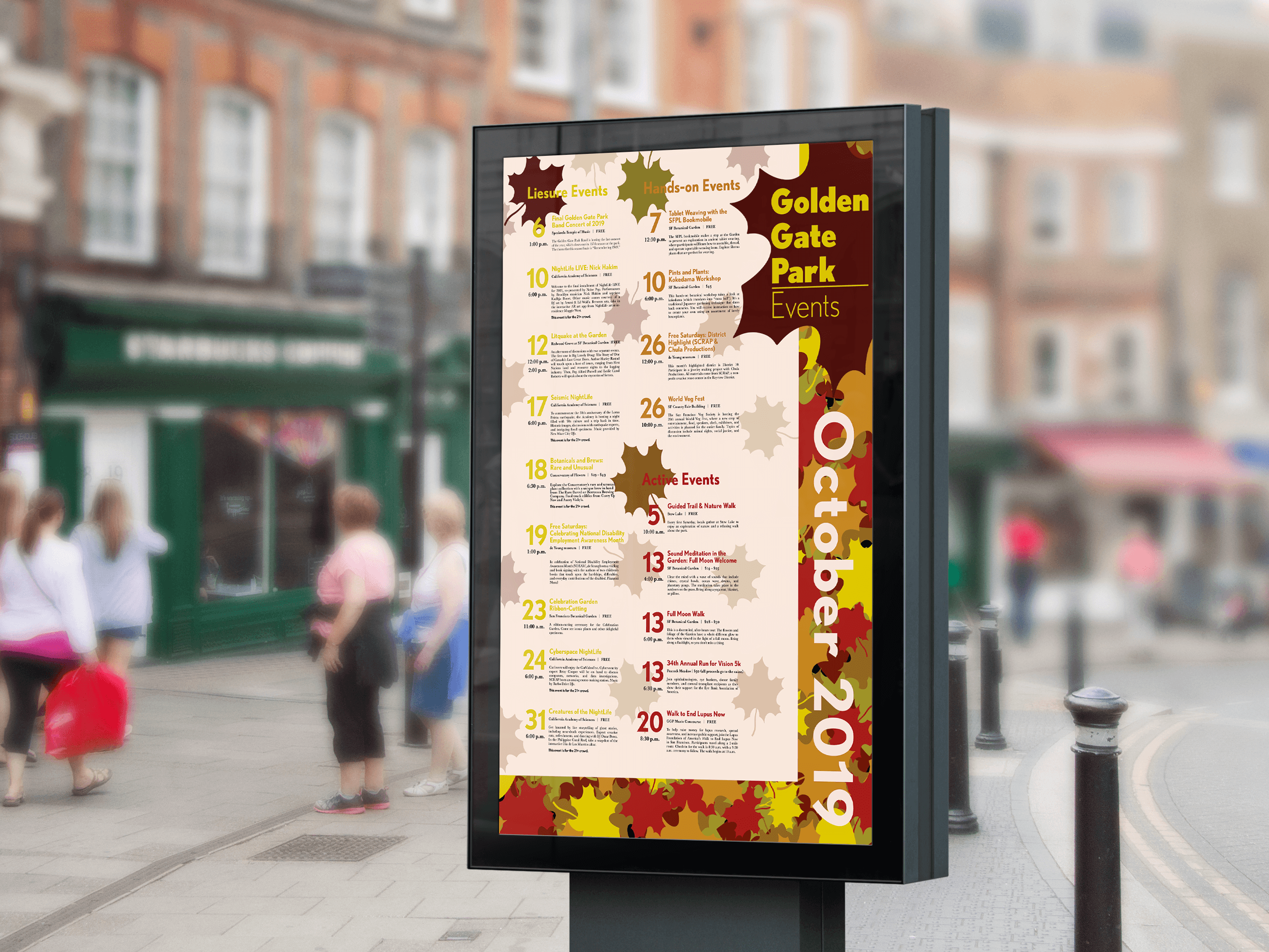
Golden Gate Park Events Poster 2019
2021
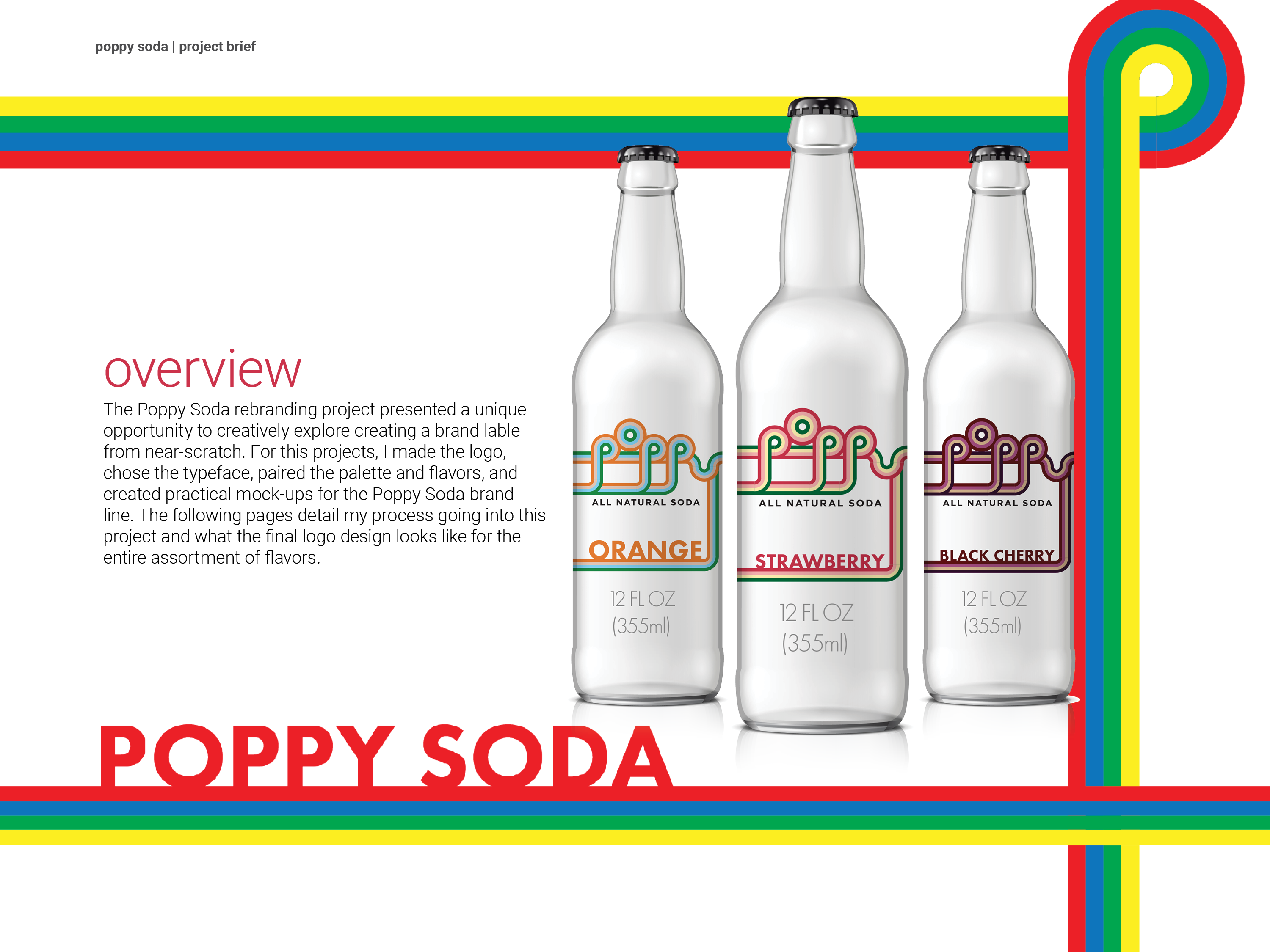
Poppy Soda Rebranding
2022
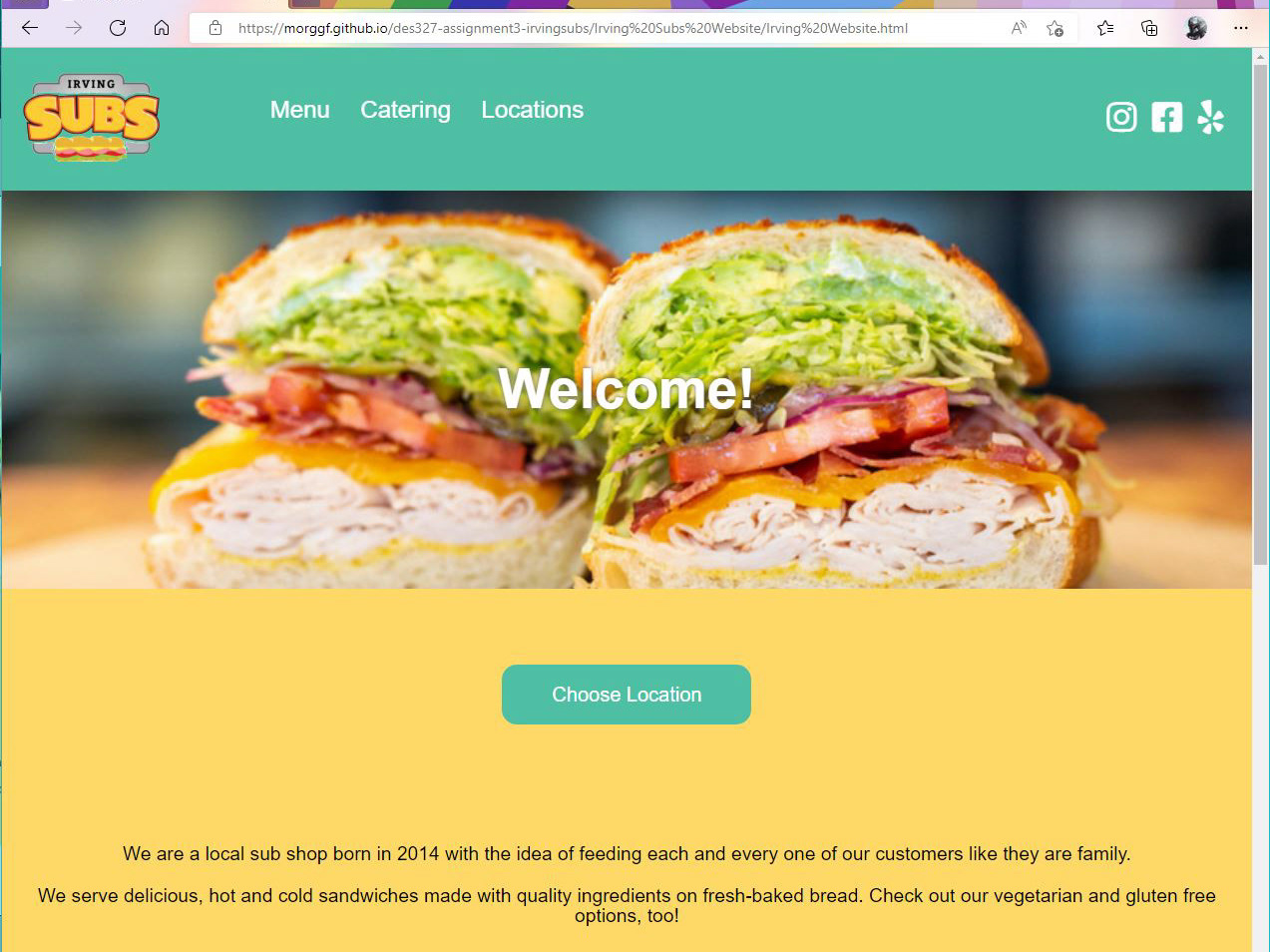
Irving Subs Website Redesign
2022
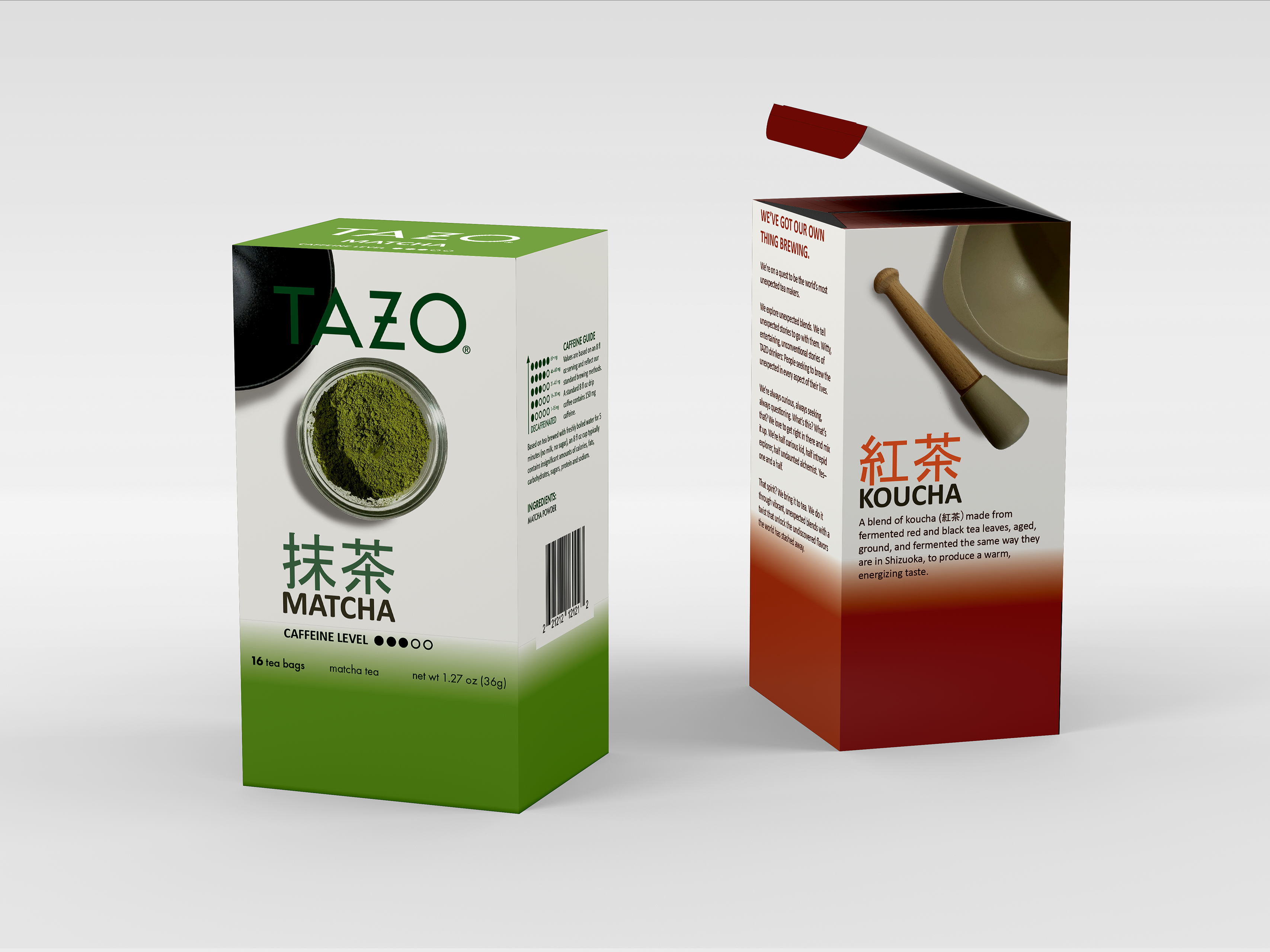
TAZO Japanese Tea Line
2021
Irving Subs / Sunset Subs Rebranding
2021

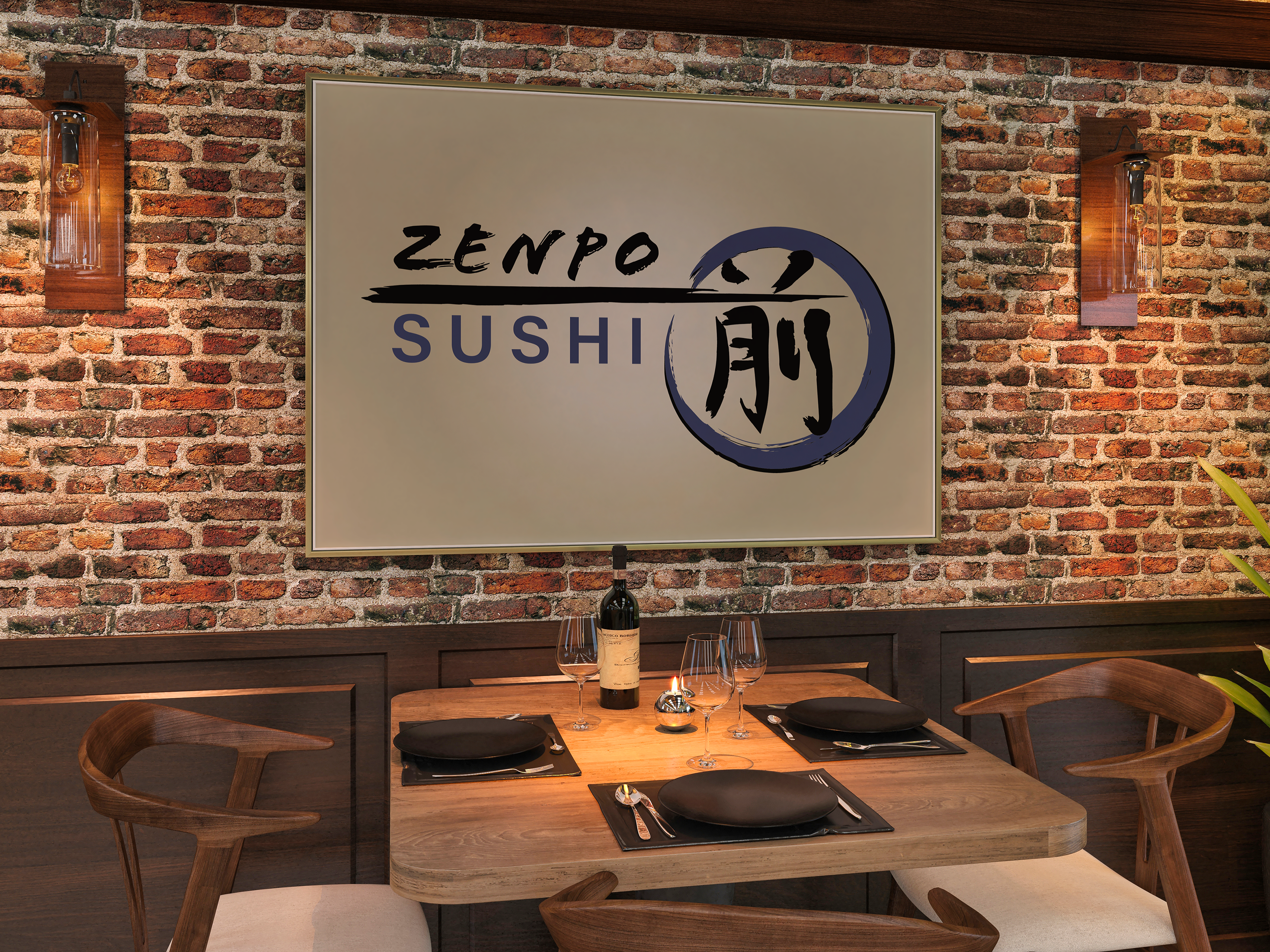
Zenpo Sushi
2024
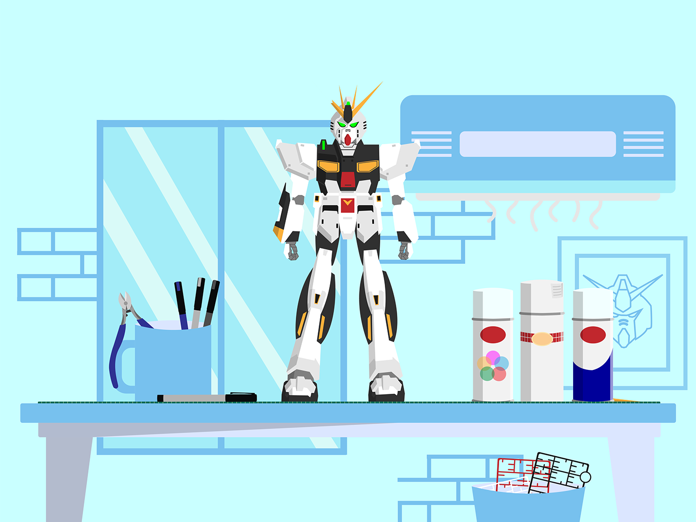
Pro vs. Amateur Gundam Model Kit
2022
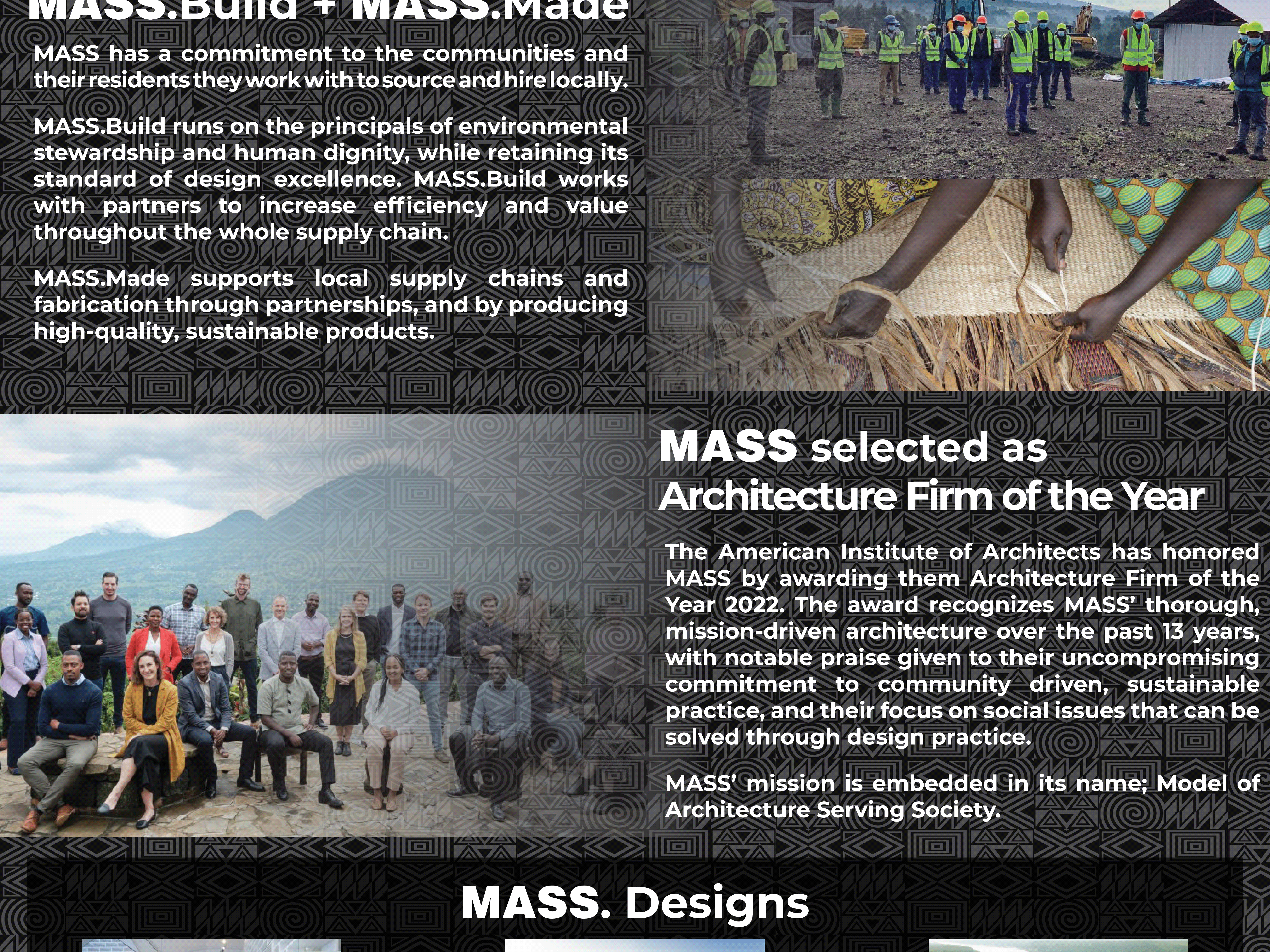
MASS. Design Poster
2022
Oculus Gaming UI Redesign
2022
The Book of Boba Fett Poster
2022
